One page, not a site.
A comparison guide for security guards who, in the client's words, barely read. What we cut, what we kept, and why the only interactive element on the page is the one that won the job.
The brief, in his words
Thomas runs a firearms training company in Las Vegas. One of his courses is the two-day PILB armed guard class that working security guards in Nevada have to pass. He wanted a separate site, on its own domain, that compared the local providers and sent people to his booking page. Not a booking site. A proof page.
Two things he said shaped everything after. The first was about the audience: many of the guards who need this course barely read, so the page had to be visual and short. The second was his standard for the whole thing: "less is more", and he meant it. He also said what won the job: the sample we sent was interactive. Clicking the top row of the comparison table opened it up. That was the whole difference.
What one page means in practice
The temptation on any brief is to produce a sitemap. Home, about, courses, requirements, contact. That is a description of the company, organised for the company, and it would have sent this audience away. Instead the page is one scroll with anchor navigation, and every section exists to answer the question a guard actually arrives with.
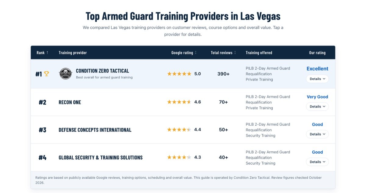
- Who should I train with? A sortable table of the providers, ranked, with their real Google ratings and the training each one offers. Tap a row and it opens with the detail.
- What is it like? A what-to-expect walkthrough of the two days, as tabs, so the whole thing fits on a phone screen.
- What does the state want from me? The Nevada requirements, in the short version.
- The questions people actually ask. Not a FAQ written to fill space. The ones the instructor gets on the phone.
There is one call to action, repeated: book the course. It sits in the header, under the table, and pinned to the bottom of the screen on phones. Nothing else on the page leads anywhere except his booking page. The client's phrase for this was "we don't want them to click out", and it decided a few things on its own: the competitors in the table have no links, and there is no "visit website" button next to anyone.
The decisions we made without being asked
Only real numbers, with the date they were checked. The site ranks its own operator first, which is fine, but it means every figure on the page has to survive a sceptical reader. The ratings are public Google figures, the page says when they were checked, and the "operated by Condition Zero Tactical" disclosure stays visible under the table. A comparison page that hides who runs it is a page that loses the argument the moment someone notices.
A custom WordPress theme, not a page builder. Everything the client owns runs on WordPress, so the site is a classic WordPress theme, hand-written, uploaded through the admin he already has. He edits text, photos and links in the Customizer and adds articles as normal posts. The design is ours; the keys are his. It also means the same theme can be reused on his other domains by swapping the content, which was the point of doing it properly the first time.
His layout, our interaction. He had a mock he liked because it put the reviews front and centre. We used it, rather than the layout of our own sample, and brought the interaction across. The client had the taste, and we had the mechanism. Arguing about the layout would have cost the job.
Timeline
Kickoff call on a Thursday evening. Live on the Friday. That is not a boast about speed so much as a consequence of the brief being clear and the scope being small on purpose. Most of the time between the two went on measuring real things: checking the rating figures, testing the table and tabs at phone widths, and making sure the admin could actually change the copy without us.
What we would tell anyone building a page like this
- If the audience does not read, do not write. Make the page a sequence of things to tap.
- One action. If a link does not lead to it, it is a leak.
- Your own numbers have to be checkable, or the whole page reads as marketing.
- Build it so the client can edit it. The version that needs you for every comma is not finished.